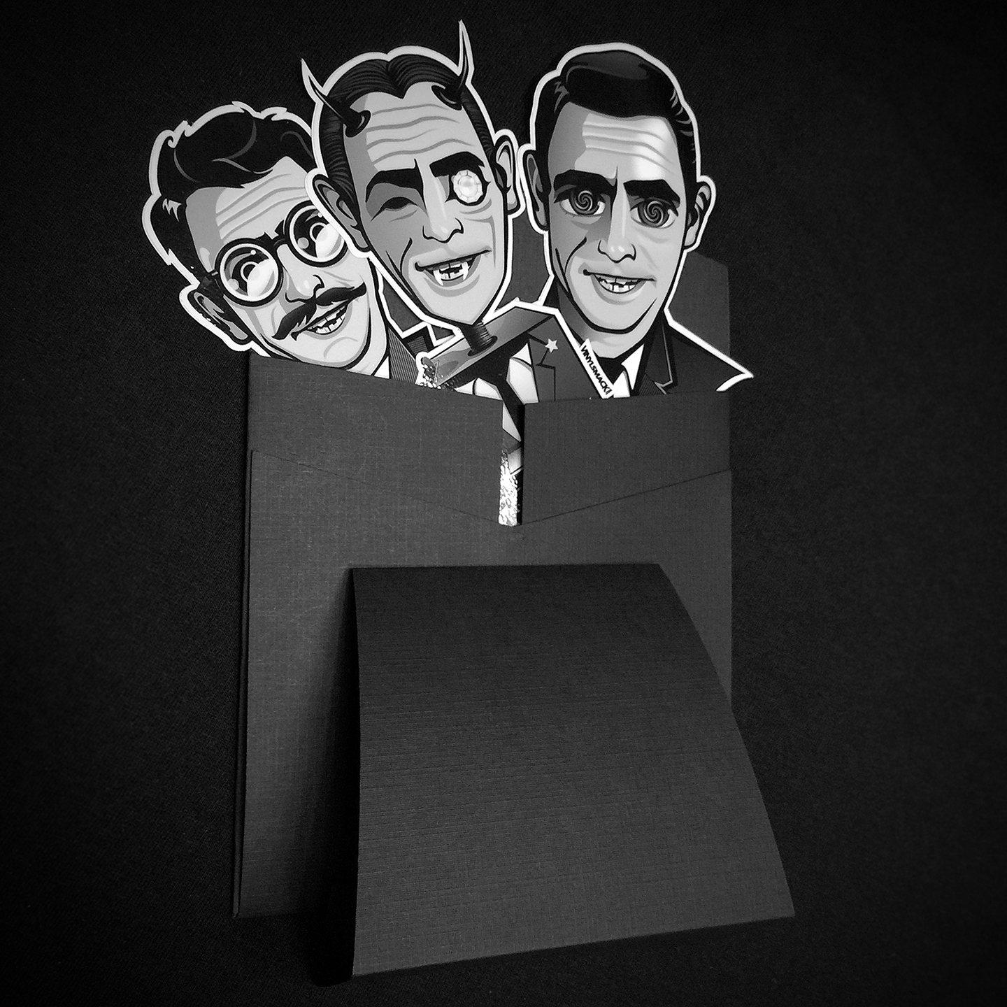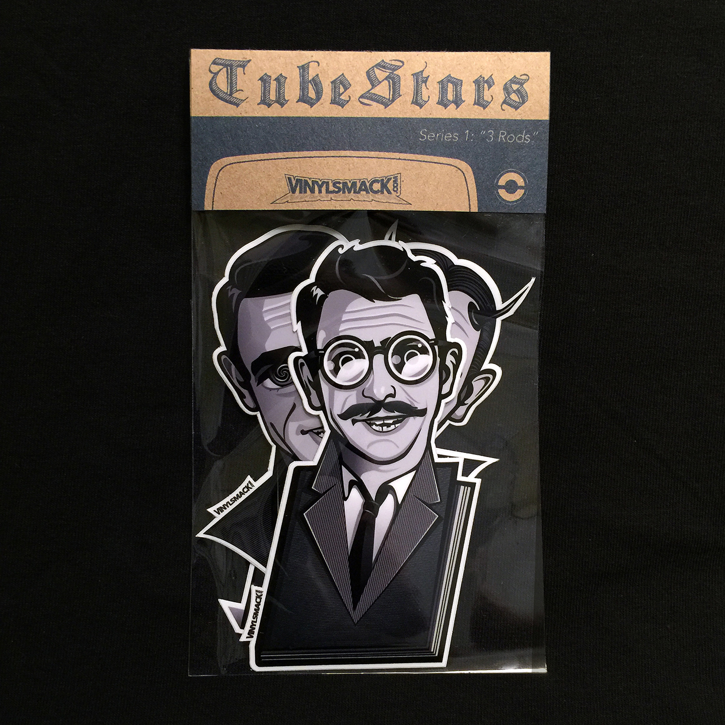


My latest product from VINYLSMACK.com features The Twilight Zone’s Rod Serling. I got this idea a while back. Here’s some of the back story for the inspiration:
I’ve always been a fan of the Twilight Zone and would watch it all day whenever one of the marathons came on. If I remember correctly, they aired on Thanksgiving and on the fourth of July. As a younger kid, I’d watch it from a safe and curious distance. I knew that some of them were creepy so hence the need for a safe distance. As I got older though, I loved some of the weighty topics that Rod Serling would tackle on the show. Many have written on the topic of Rod Serling and how he dealt with social and philosophical issues so I won’t belabor that here. There was something about that feeling after most episodes where I felt I was taken through a nightmare and left unscathed. I learned a lesson of sort through the subject matter. And how could you not love Rod appearing on those intros and outros of the show. He was like a Willy Wonka, taking us through his factory from another dimension. I wish he could’ve done more. 156 episodes weren’t enough!
Now back to the 3 illustrations I designed. Since Rod Serling was such a prolific writer and steered his vision of what the show was, I thought it would be awesome to feature a version of Rod in every illustration; with a twist of course like every episode.
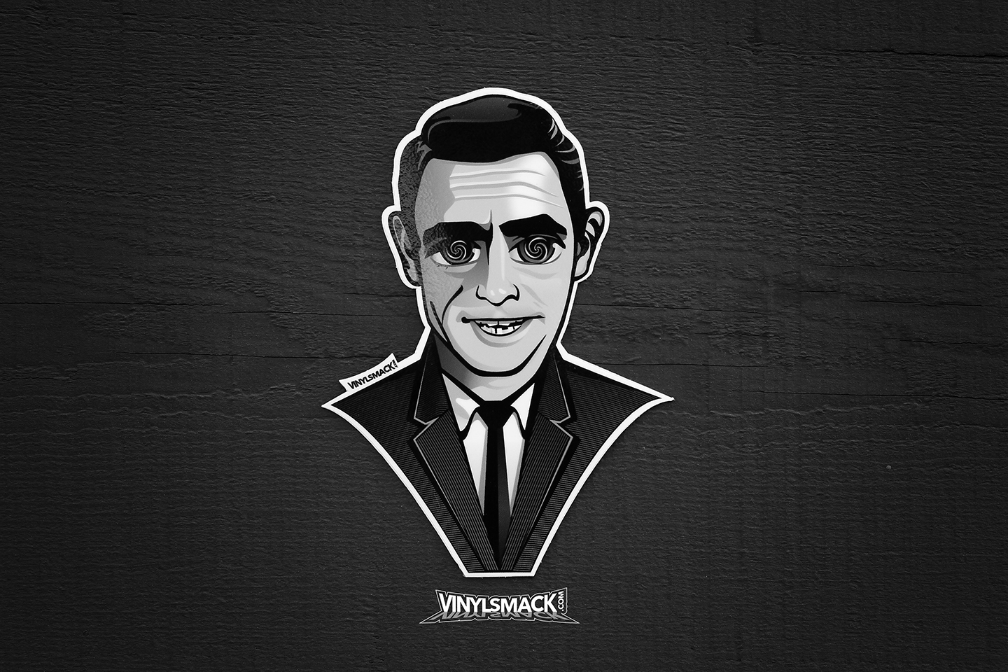
The first I developed is Rod Serling as himself. This first design came from a sketch I did a while back of Rod Serling with very large, black, zombie-like eyes. I did this because of the creep factor of the show at times. I kept it simple and added those Twilight Zone swirls from the show’s intro.
The next design I tackled was inspired by one of my personal favorites, “Time Enough at Last” which starred Burgess Meredith. For this, there’s a few things going on. First, I wanted it to look like Rod but also like “Henry Bemis,” the episode’s main character. Early on I decided that the characters should have Rod’s facial characteristics and have other external elements that make up the actor he’s “portraying. For the Bemis illustration, he’s all Bemis but still Rod under the glasses, crazy hair, and mustache. I also implemented his love of books into his suit, an element most fans would get!
The third design is taken from “The Nick of Time.” For this, instead of having Rod illustrated as William Shatner’s character, I made him the more obvious choice, the mystic from the diner table. He has Rod’s features but shares most of the features from the show version. For the box itself, I brought in elements from his suit to wrap around the box. Instead of copying the words from the box, I thought it fitting to use a portion of Rod’s words at the closing of the show, “Counterbalance in the little town of Ridgeview, Ohio. Two people permanently enslaved by the tyranny of fear and superstitution, facing the future with a kind of helpless dread. Two others facing the future with confidence – having escaped one of the darker places of the Twilight Zone.”
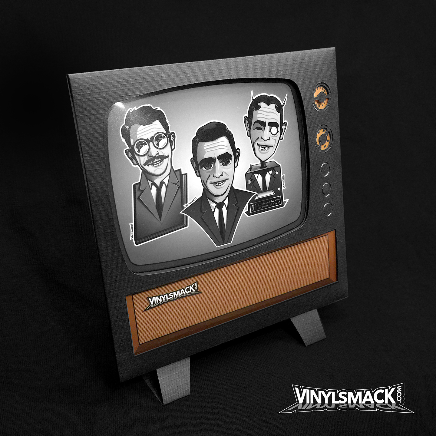
Once I finished designing the 3 illustrations for the die-cut sticker set, I went on to develop the a special edition package that features an envelope in the shape of a TV set complete with a stand on the back. Everything I design at VINYLSMACK has some handmade elements. The set is made of die-cut card stock and a plastic window. I hope you enjoy them. They’re now available for purchase over at: vinylsmack.com
